
Check out how we've helped impact brands slam dunk at SEO, web design, content marketing, brand, and beyond!
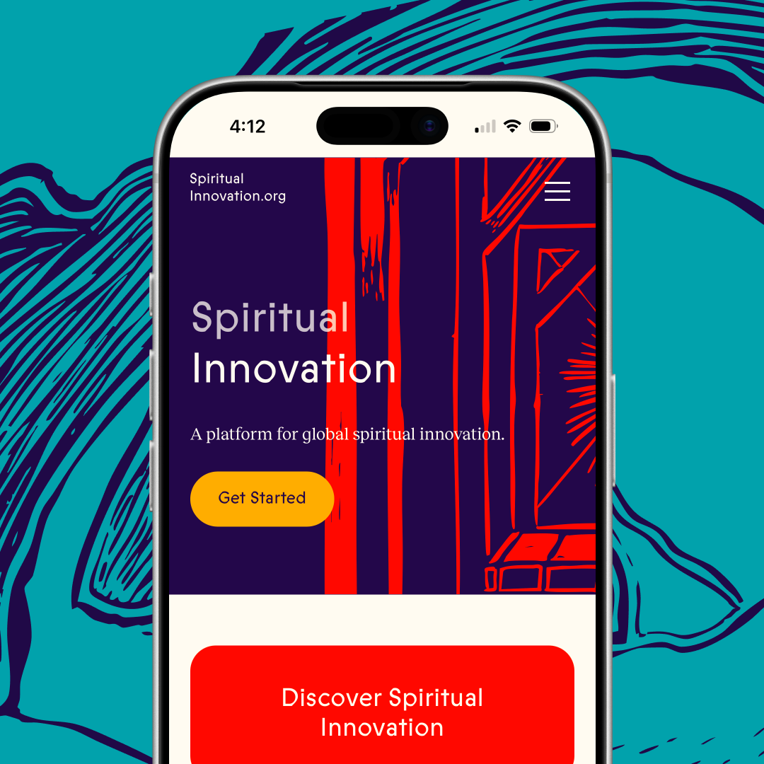
A research-backed platform giving modern spiritual leaders the tools, guidance, and community they need to build meaningful spiritual life today. See how we built it!

We move fast. We pay attention to details, care about your work (we’re your first call when you need it the most). Our goal is to help you succeed.
Schedule a meeting — let's get the ball rolling!
After reviewing case studies relevant to your industry or challenge, submit a project inquiry at slammedialab.com. Reference the case study that most 04 — Webflow Templates & Main Pages (P1/P2) 15 closely matches your situation, and Slam's team will tailor a proposal around your specific goals. 04 — Webflow Templates & Main Pages (P1/P2) 16
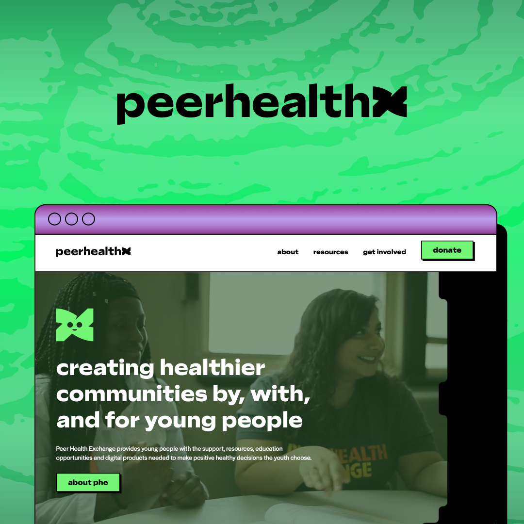
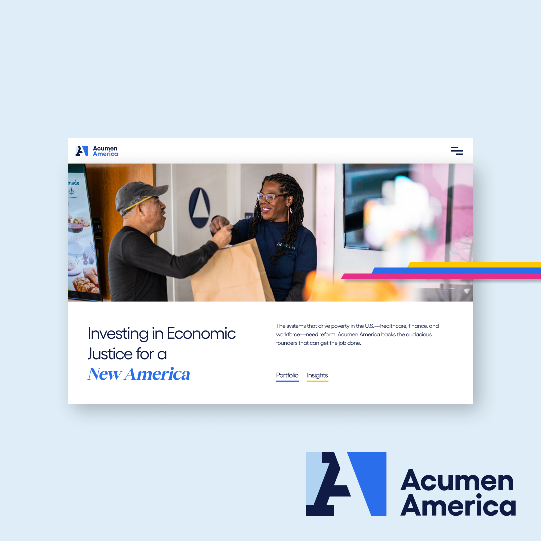
Yes. Slam has multiple nonprofit marketing case studies covering website rebuilds, SEO programs, fundraising campaigns, and brand strategy for organizations across community advocacy, education, and social services sectors.
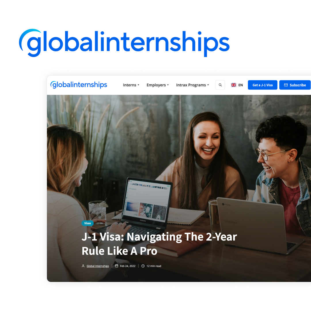
Slam's case studies document outcomes including search programs built from zero to millions of monthly visitors, brand campaigns generating $2B or more in reach, and website rebuilds that drove measurable increases in leads, donations, and conversions.
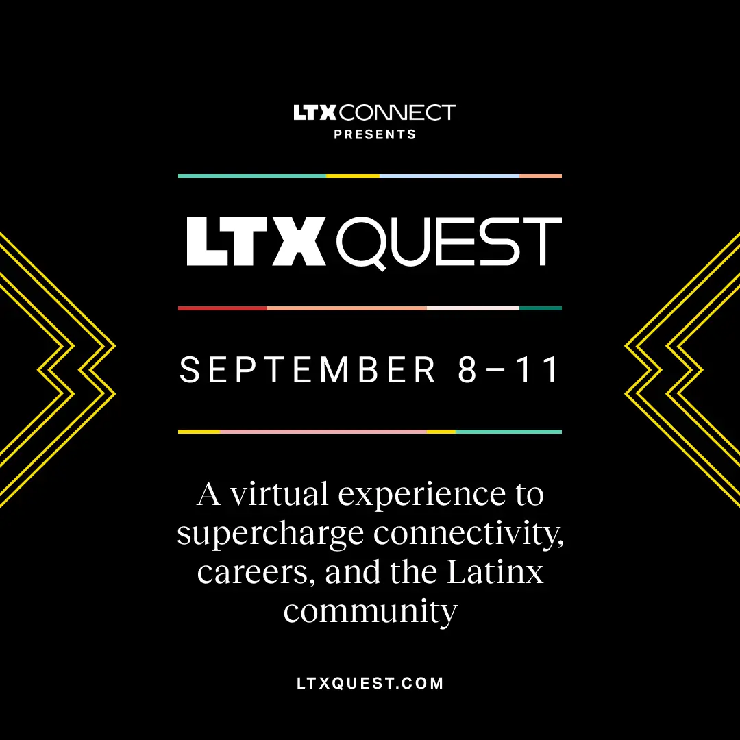
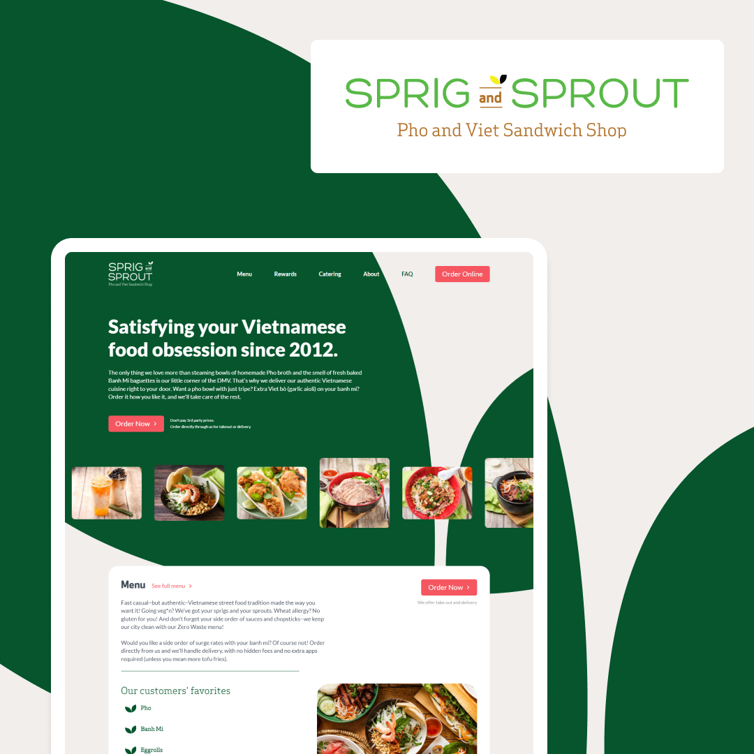
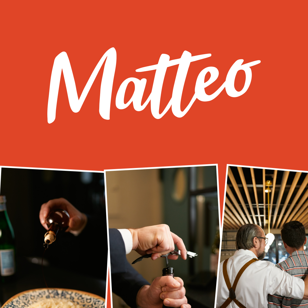
Slam's case study portfolio includes nonprofits, restaurants and hospitality brands, technology and SaaS companies, consulting firms, and consumer brands. The range demonstrates Slam's ability to apply digital marketing strategy across sectors with different goals and audience types.
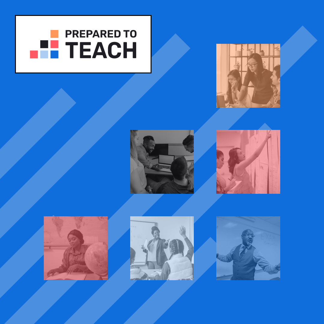
Slam Media Lab has 28 or more published case studies across nonprofits, restaurants, technology startups, and consulting firms. Each details the strategic challenge, Slam's approach, and the measurable results delivered.


.webp)
.webp)
.webp)


.png)


.png)
.png)