
Fresh Approach
True to their name, Fresh Approach wanted a new direction for their brand. We built them an earthy, organic identity that speaks to farmers, families and neighbors across the Bay Area.
The TL;DR
Fresh Approach is a California nonprofit that brings locally grown produce, nutrition education and gardening skills to communities across the Bay Area, so everyone can enjoy healthy food. We partnered with them on a full brand refresh: strategy, a simpler logo, a warm new palette, hand-drawn illustrations and a brand guide their team uses for flyers, social posts and email.
The Challenge
How do you build a brand that speaks to everyone, from local farmers to the communities they feed, and plants the seeds for lasting change?
Fresh Approach serves a wide mix of people: seniors, youth, families using CalFresh and the farmers who grow the food. Their old look didn't match the energy of their programs, and it was hard to keep things consistent across flyers, social posts and emails. They needed a brand that felt welcoming to every one of those groups and was simple enough for a small team to use every day.

The Journey

Get to Know the Community
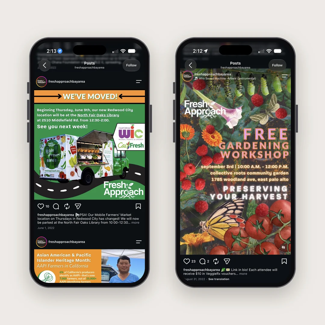
We started by listening. We talked with seniors, youth and farmers to learn what they cared about and where they spent their time. A lot of them were on Instagram, Nextdoor and WhatsApp, so the brand had to work just as well on a phone screen as on a printed flyer at the market.

Set a Vision for the New Identity
Next we shaped the look and feel. We wanted the brand to feel like a busy farmers' market: colorful, friendly and full of fresh food. We explored organic shapes, color pairings, handwriting and illustration styles until the direction felt warm and true to Fresh Approach.

Bring the Brand to Life
Then we made it real. We simplified the logo into a clean horizontal lockup with a sprout growing out of the "o". We named the colors after produce, like Spring Peas and Fresh Carrots, paired Montserrat headings with Oxygen body text, and drew a library of hand-drawn fruits and vegetables.
The Solution
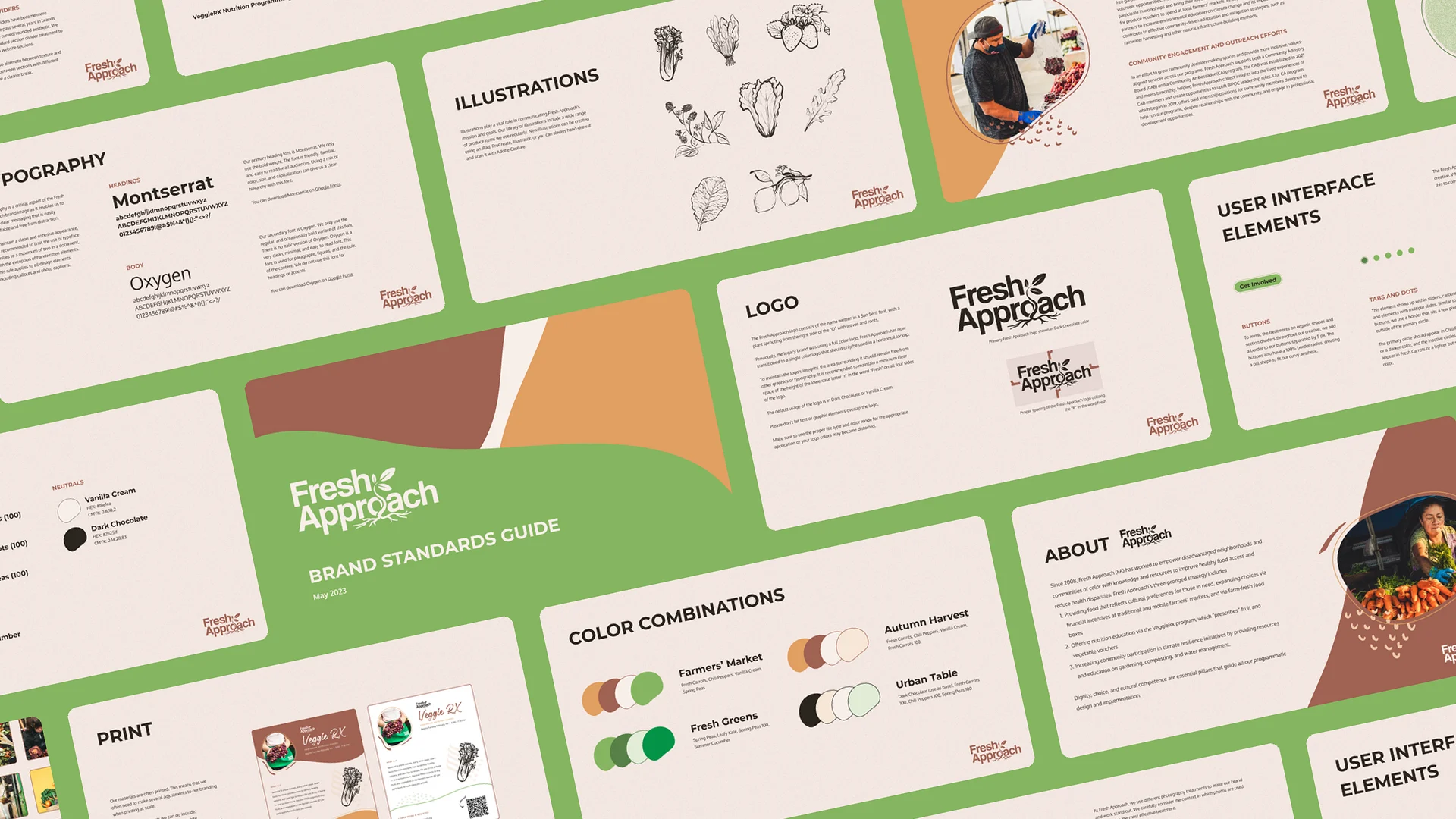
The result is a brand that feels fresh, earthy and welcoming. A full brand standards guide gives the Fresh Approach team everything they need to keep it consistent, from market flyers to Instagram.
An Earthy, Organic, and Fresh Brand
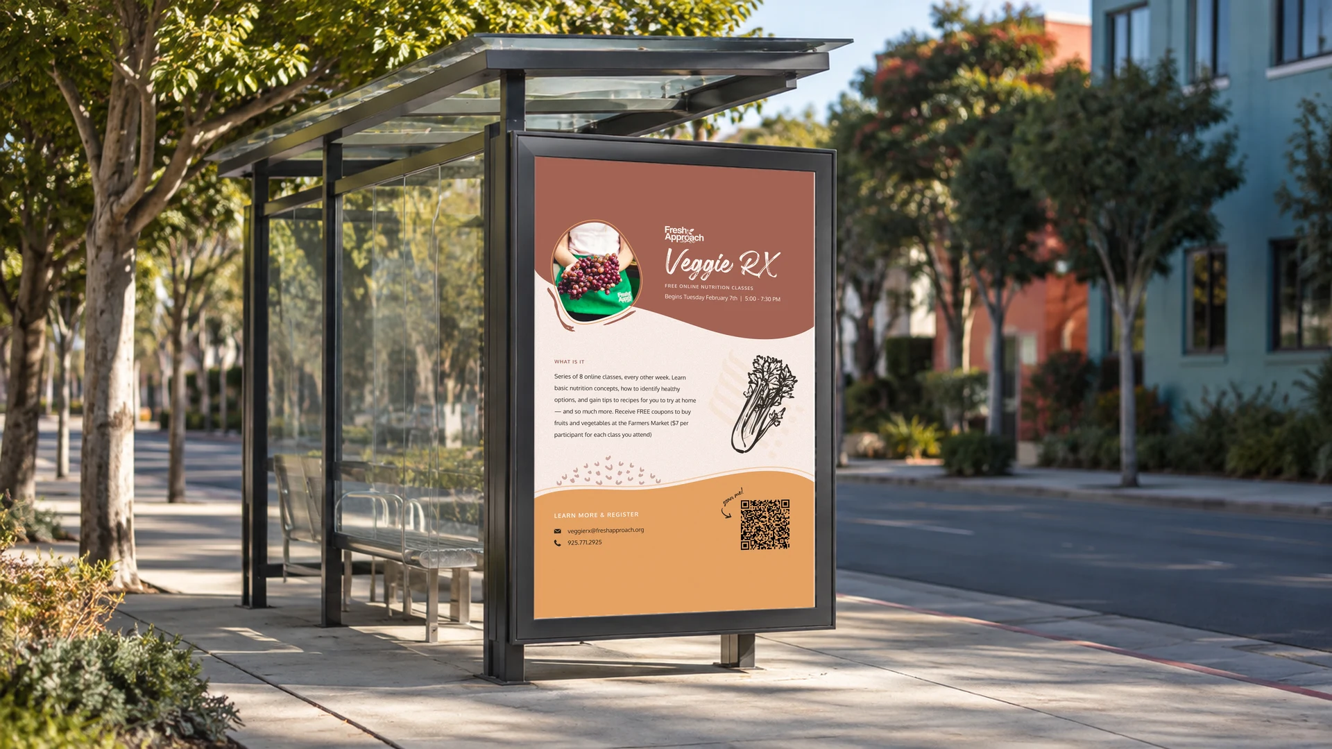
The new logo, the Montserrat and Oxygen pairing, hand-drawn produce illustrations and photos framed in soft organic shapes all work together. Each piece feels handmade and approachable, like the markets Fresh Approach runs.
Inclusive, Clear, and Bold Messaging
We built the messaging around three pillars: access to food, healthy eating and community empowerment. The voice is a "casual expert": friendly and easy to understand, but backed by real knowledge.
A Channel Strategy for Key Programs
We mapped out how to promote key programs, including the new farmer program in East Palo Alto, Richmond and West Oakland. The plan leans on recipe features, farmer profiles and live coverage from events.
Ready-to-Use Templates
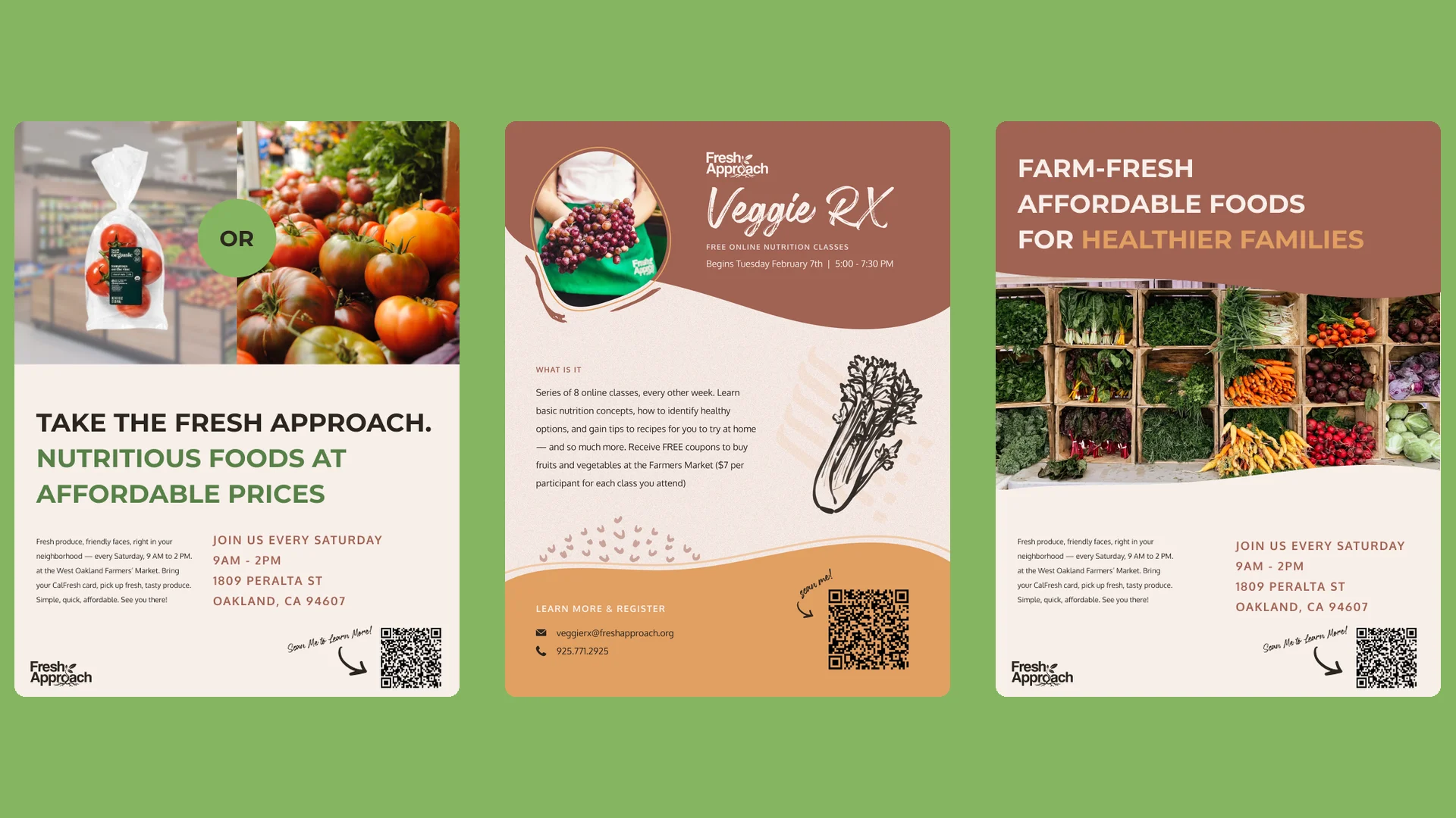
We put the brand to work right away with print and digital pieces, including the Veggie Rx class flyer, farmers' market flyers, recipe posts for social and an email newsletter.


Hear What Our Client Has To Say

Our brand work has never been this strong, and thanks to their work, we’ll be able to make our brand and mission stand out online and in-person. Slam is equipped with a stellar team!
FAQs
Fresh Approach is a Bay Area nonprofit that has worked since 2008 to bring locally grown produce, nutrition education and gardening skills to communities that need them most.
Slam Media Lab led the brand strategy and identity, including the logo refresh, color palette, typography, illustrations and brand standards guide.
It was a refresh. Fresh Approach kept their name, and we simplified the logo and built a new palette, type system, illustration style and brand guide around it.
Montserrat Bold for headings and Oxygen for body text, both free on Google Fonts, plus a handwritten accent font used sparingly.
Sparked Your Curiosity?
Read more of our case studies and learn about how we slam, so you can jam.

Let’s Make Something Amazing!
We move fast. We pay attention to details, care about your work (we’re your first call when you need it the most). Our goal is to help you succeed.
Schedule a meeting — let's get the ball rolling!


