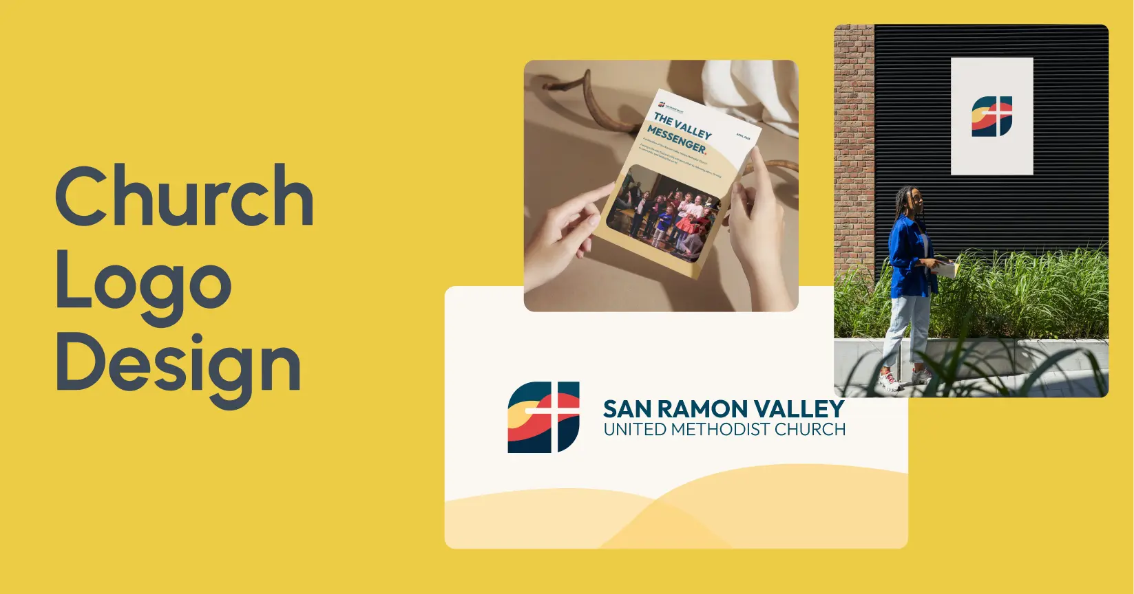
When we redesigned the brand for San Ramon Valley United Methodist Church (SRVUMC), the conversation started with a question I did not expect: "How do we look welcoming to a 28-year-old who has never been to church, without making our 70-year-old members feel like we forgot about them?"
That question is the entire challenge of church logo design in one sentence. You are designing for a community that spans generations, backgrounds, and levels of familiarity with faith. The logo needs to feel both timeless and current, roted and inviting, sacred and approachable.
For SRVUMC, we started with a full brand audit. Their existing logo was detailed and ornate, designed for print bulletins in the early 2000s. It broke at small sizes. It did not render well as a social media avatar. And it looked dated next to the modern, minimalist logos of newer churches in the area competing for the same families.
We rebuilt their visual identity around a clean, geometric mark that referenced their architectural steeple, paired it with a modern sans-serif typeface, and carried the new brand across their website, signage, and all digital touch-points. The result: a brand that felt fresh to younger visitors and familiar to longtime members because the core identity, the colors, the warmth, the sense of welcome, stayed intact.
.png)
At Slam Media Lab (Slam), we have done church branding and church website design for congregations navigating exactly this tension. A church logo is not just a graphic for your bulletin. It is the first impression your community makes on every visitor, every website click, and every social media post. This guide covers what strong church logos have in common, what design trends are shaping church branding in 2026, what professional church logo design costs, and how to choose the right designer.
Why Your Church Logo Matters More Than You Think
There are roughly 350,000 to 420,000 churches in the United States, according to the Hartford Institute for Religion Research. About 15,000 churches are expected to close in 2025 alone. The congregations that are growing share a common trait: they communicate clearly and consistently across every touchpoint, digital and physical.
Your logo is at the center of that communication. It appears on your website, your social media, your signage, your bulletins, your event flyers, your giving platform, and every piece of church graphic and print design your team produces.
75% of consumers recognize a brand by its logo, and first impressions form within 10 seconds. For churches, those impressions happen when someone drives past your building, searches your name on Google, or sees a friend share an event on Instagram. A dated or confusing logo sends a message before anyone reads a word of your content: "This church may not be for me."
63% of churches say marketing is important or extremely important, but 76% are not tracking their marketing results. That gap means many churches invest in outreach without knowing whether their visual identity is helping or hurting. A strong church logo does not guarantee growth. But a weak one creates a barrier that even the best programming cannot fully overcome.
What the Best Church Logos Have in Common
After studying church branding across denominations and sizes, here are the patterns that separate effective church logos from forgettable ones.
- They communicate a clear idea. The strongest church logos communicate one concept clearly: community, growth, welcome, faith, light, shelter. Logos that try to communicate three or four ideas at once (a cross AND a dove AND a globe AND a family) end up communicating nothing. Simplicity wins.
- They work at every size. Your logo needs to be legible as a 16px favicon on a browser tab, recognizable as a social media avatar, clear on a sign from 50 feet away, and elegant on a printed bulletin. Logos with fine detail, thin lines, or complex illustrations break at small sizes. Test every concept at the smallest size first.
- They balance tradition and modernity. Churches serve multigenerational communities. A logo that looks like a tech startup may alienate older members. A logo that looks like it was designed in 1985 may not attract younger visitors. The best church logos find a middle ground: clean and current, but with visual references to heritage and permanence.
- They use color intentionally. Color carries meaning, especially in a faith context. Blue conveys trust and peace. Green suggests growth and renewal. Gold and warm tones signal warmth and welcome. Deep purples communicate royalty and reverence. Choose colors that reflect your church's personality, not just what looks trendy.
- They stand alone without the church name. The strongest logos include an icon or mark that works independently from the wordmark. This gives you flexibility: you can use the full logo on your website header and the icon alone as a social media avatar or app icon.
Church Logo Design Trends in 2026

Church logo design has evolved significantly in the past decade. Here are the six trends shaping the field right now:
- Minimalism and clean lines over ornate detail
- Flat design replacing 3D effects and gradients
- Sans-serif and custom typography gaining ground
- Geometric shapes replacing literal religious imagery
- Nature elements (trees, water, light) connecting faith to growth
- Braver, more vibrant color palettes
Here is what each trend looks like in practice.
Minimalism Is Dominant
Clean lines, simple shapes, generous white space. The era of ornate, detailed church logos with Gothic lettering is giving way to designs that feel modern and approachable. This is not about looking secular. It is about looking confident and clear.
Flat Design Has Replaced 3D Effects
Drop shadows, gradients, and beveled edges are disappearing from church logos. Flat, two-dimensional designs reproduce better across digital and print, and they age more gracefully.
Sans-Serif Typography Is Growing
Traditional serif fonts (Times New Roman, Garamond) still work for churches that want to emphasize heritage and gravitas. But more congregations are choosing sans-serif typefaces that feel clean and accessible. Custom typography is also gaining popularity for churches that want something truly distinctive.
Geometric Shapes Are Replacing Literal Imagery
Instead of a realistic dove or a detailed cross, many modern church logos use geometric interpretations of these symbols. A triangle suggesting a mountain or a trinity. A circle representing community. Abstract shapes that invite interpretation rather than dictating meaning.
Nature Elements Are Rising
Trees, sunlight, water, leaves. These symbols connect faith to growth and life without being exclusively religious, which makes them effective for churches reaching people who are exploring faith for the first time.
Color Palettes Are Getting Braver
Muted earth tones are being joined by vibrant palettes: warm oranges, bold teals, and rich magentas that convey energy and warmth. The color choice increasingly reflects the specific personality of the congregation rather than a generic "church" palette.
What Church Logo Design Costs
Church logo design pricing varies based on who you hire and how comprehensive the engagement is.
By provider type:
- DIY tools (Canva, Looka, LogoDesign.Net): $0 to $100. You get a template-based graphic. No strategy, no uniqueness, limited file formats.
- Freelance designers: $1,000 to $5,000 for a custom church logo with 2 to 3 concepts and a few rounds of revisions.
- Small design studios: $5,000 to $15,000 for logo design within a broader brand identity engagement (logo, colors, typography, basic guidelines).
- Full-service agencies: $5,000 to $50,000+ for a complete church branding engagement including strategy, visual identity, brand guidelines, and potentially website design.
What affects the price:
- Strategic depth. A logo designed after a brand positioning exercise costs more than a logo designed based on a creative brief. The strategic version performs better because it is grounded in research about your community, your audience, and your competitive landscape.
- Deliverable scope. A logo-only project is simpler and cheaper. A project that includes the logo, color system, typography, brand guidelines, bulletin templates, social media templates, and signage specifications is a full brand system.
- Website inclusion. If your church logo refresh includes a new website, the budget increases significantly. At Slam, we build church websites on Webflow through our Webflow design and development practice, which keeps costs lower than custom development.
The recommended marketing budget for churches is 10% to 12% of the total church budget, according to ResourceUMC. A professional church logo and brand identity is a one-time investment within that budget that pays dividends for 5 to 10 years.
Google offers qualifying churches up to $10,000 per month in free Google Ad Grant credits. That free advertising becomes far more effective when it drives people to a website with a professional, cohesive brand identity.
Church Logo Design Process: What to Expect
A professional church logo design engagement follows a structured process. Here is what each phase looks like.
Phase 1: Discovery (1 to 2 Weeks)
The designer or agency learns about your church: your mission, your congregation, your community, your growth goals, and your current challenges. At Slam, we use our brand discovery questionnaire to structure this phase.
Key questions for churches:
- Who is your primary audience? (Families, young adults, retirees, seekers?)
- What is your denomination and theological tradition?
- What three words should people associate with your church?
- Who are the other churches in your area, and how do you want to differentiate?
- What do you love about your current brand? What is not working?
Phase 2: Concept Development (2 to 3 Weeks)
The designer creates 2 to 4 logo concepts, each exploring a different visual direction based on the discovery findings. Concepts should be presented with strategic rationale, not just aesthetic appeal.
Phase 3: Refinement (1 to 2 Weeks)
Your church leadership selects a direction, and the designer refines it through 2 to 3 rounds of feedback. This is where color, typography, and proportions get finalized.
Phase 4: Delivery (1 Week)
Final logo files in all formats (SVG, PNG, PDF), color specifications, and usage guidelines. For full brand engagements, this also includes a brand style guide, templates, and application examples.
Total timeline: 5 to 8 weeks for logo and identity. Add 6 to 10 weeks if the engagement includes a website redesign.
How to Choose a Church Logo Designer
Not every designer understands churches. Here is how to find one who does.
- Look for church or nonprofit experience. A designer who has worked with congregations understands the unique dynamics: committee decision-making, multigenerational audiences, theological sensitivity, and the difference between a church and a business. At Slam, we have done both church branding and nonprofit branding for mission-driven organizations.
- Ask about their process. If the designer starts with "send me your ideas and I will design something," that is a red flag. A professional process starts with discovery and strategy, not Photoshop.
- Check for digital expertise. Your church logo needs to work across a website, social media, email, and mobile screens. A designer who primarily works in print may not test for digital requirements. Ask how they ensure the logo works at small sizes and on dark backgrounds.
- Evaluate their portfolio for range. Look for logos that are diverse in style, not a portfolio where everything looks the same. A designer with range will create something unique to your church rather than applying a house style.
- Ask about implementation. Can they also build your website, create your bulletin templates, and design your social media graphics? An agency that handles the full scope, like Slam, ensures everything is visually consistent from day one.
Red flags:
- They offer unlimited revisions (this usually means no strategic structure)
- They show only secular portfolio work with no experience in churches, nonprofits, or faith-based organizations
- They cannot explain the strategic reasoning behind their designs
- They do not ask about your congregation, community, or growth goals
How Slam Approaches Church Logo Design
At Slam Media Lab, we have built brands and websites for churches like San Ramon Valley United Methodist Church. We understand that a church logo is not just a design project. It is a community decision that shapes how your congregation presents itself to the world.
.png)
Here is what we bring to church logo design:
- Strategy-first approach. Every church logo engagement starts with positioning work. We understand your mission, your community, and your growth goals before we design anything.
- Complete brand systems. We deliver logos as part of brand identity systems that include color palettes, typography, guidelines, and templates your staff and volunteers can actually use.
- Church website integration. We build church websites on Webflow that bring your new brand to life online. One team handles brand and web, so the result is cohesive from the first click.
- Mission-driven expertise. We specialize in nonprofits and mission-driven organizations. Churches are at the heart of that work. We understand committee dynamics, volunteer teams, and the unique stakeholder environment of a congregation.
You can explore our related work on church branding, church website design, and church graphic and print design to see how we approach church communications holistically.
If your church is ready for a logo that matches the quality of your mission, get in touch. We would love to learn about your community.
Frequently Asked Questions About Church Logo Design
How Much Does a Church Logo Cost?
Church logo costs range from $0 (DIY tools) to $50,000+ (full-service agency engagement). Most churches spend between $1,000 and $15,000 for professional logo design. Freelancers charge $1,000 to $5,000 for logo-only projects. Agencies charge $5,000 to $15,000 for logo within a brand identity system. The price depends on strategic depth, deliverable scope, and whether the engagement includes website design.
What Should a Church Logo Include?
A strong church logo typically includes a meaningful symbol (cross, dove, tree, flame, geometric shape), the church name in readable typography, and a color palette that reflects the church's personality. The symbol should work independently from the name so it can be used as a social media avatar or app icon. Avoid cramming multiple symbols into one logo.
How Often Should a Church Update Its Logo?
The general guideline is a minor refresh every 3 to 5 years and a major update every 7 to 10 years. The triggers that matter more than time: your logo does not work well digitally (too detailed for social media), your congregation's identity has evolved, your church has merged or rebranded, or visitors tell you your branding feels dated compared to other churches in your area.
Can I Use a Free Logo Maker for My Church?
You can, but the result will look like a template because it is one. Free logo makers use stock icons and limited typography options, which means your logo will likely resemble other churches using the same tool. For a church that is serious about growth and community presence, investing in professional design pays for itself through stronger first impressions, better consistency across communications, and a brand that your congregation feels proud to share.
.png)