
Quiet
Website strategy, design and Webflow development for Quiet, an artist-led community built on creativity, care and empowerment.
The TL;DR
Quiet is an artist-led community founded by Sol Guy and James M. Walton. It has grown to more than 200 artists and 500 projects, but it had no real home online. We set out to build one: a public site to tell Quiet's story, and a private hub where member artists could gather. Along the way, Quiet chose to launch lean. The first release covers Home, About and Offerings, built in Webflow with the look of Quiet's Cultural Currency magazine. The full design, with the artist community, project library and resources, is ready for the next phase.
The Challenge
How do you build a home online for a community that doesn't think like a company?
Quiet came to us with a big vision. They wanted to share their story and values, show their artists and projects, publish what they've learned through cultural currencies, ways of working and listening reports, and give members a private place for workshops and conversations.
In discovery, Quiet named three values the site had to carry: creativity, community and shared purpose. It needed to feel alive, made by and for artists, and nothing like a corporation. At the same time, the team was small and many of the photos, film stills and bios were still being gathered.

The Journey

Mapping the big picture, then picking the first step
We started with a full sitemap. It covered public pages for Quiet's story, learning, teaching, people and projects, plus a member area with a login, dashboard, workshops and conversation threads. Wireframes for each page helped everyone see how much content the site would need.
Early in 2024, Quiet decided the site should be public first. A few months later they set the member hub aside so they could launch sooner with more content and less polish. We reshaped the plan around a smaller first release and kept the rest of the design ready to build.

Bringing the magazine's look to the web
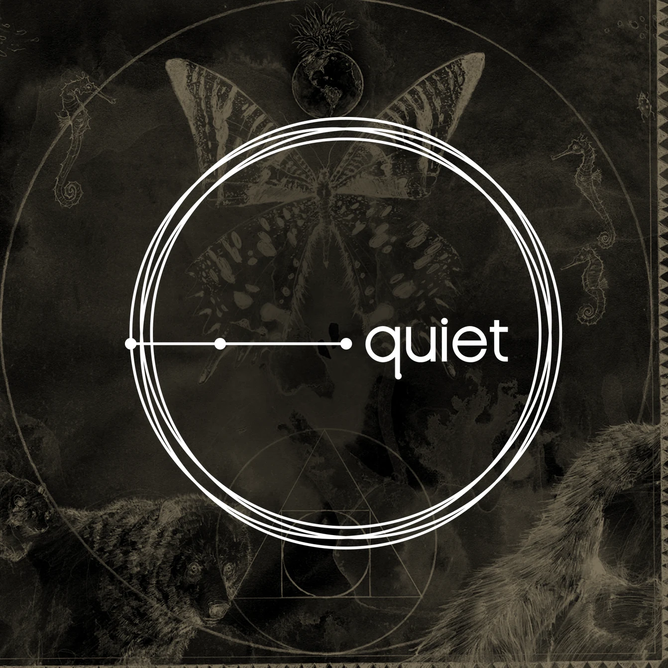
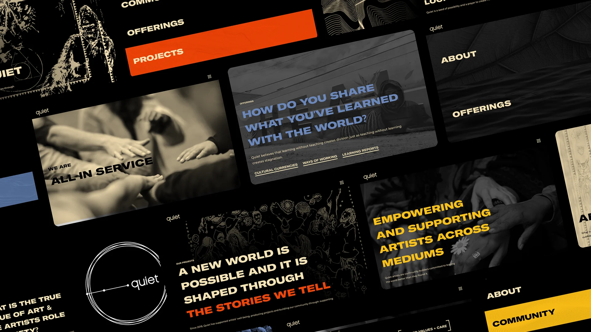
Quiet already had a strong visual voice from its Cultural Currency magazine: black and cream, wide bold capitals and rich, textured photography. Our first mood boards explored a few directions, and Quiet's feedback pushed us toward something less abstract and more modern classic.
So we built on what Quiet already owned instead of inventing something new. We set the magazine's type and colors up for the web, then gave each part of the site its own color, yellow for community, blue for offerings and orange for projects, so people always know where they are.

Designing the full experience
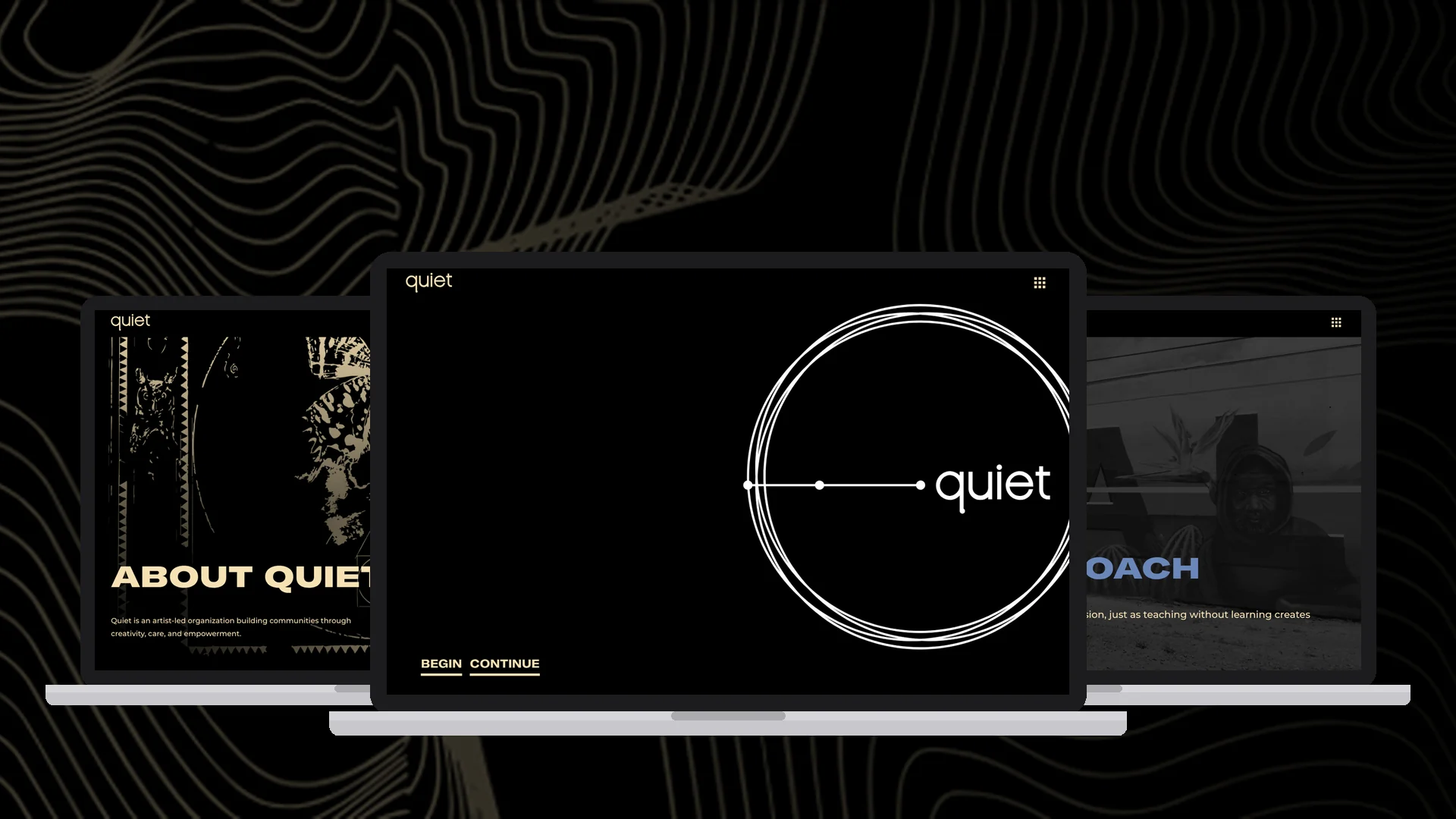
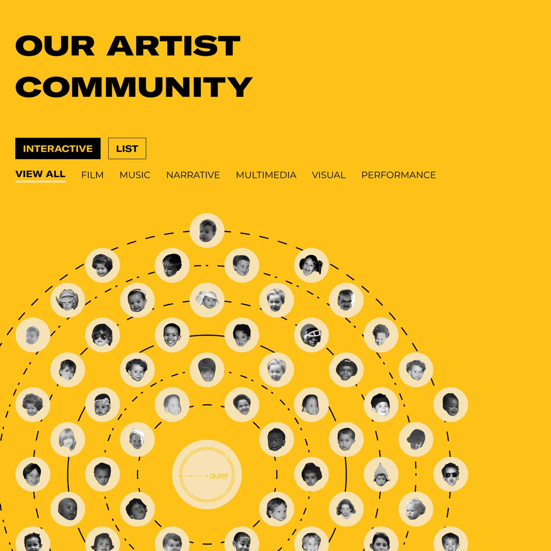
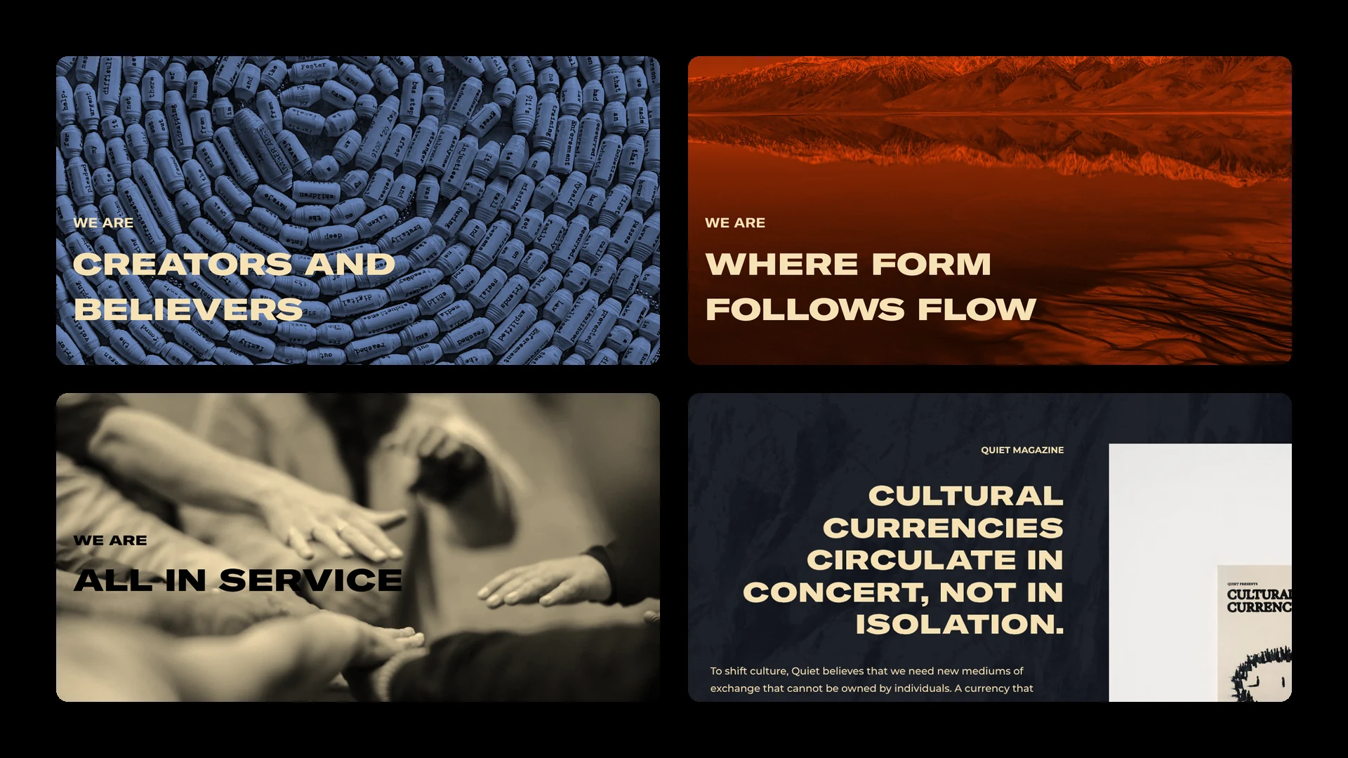
We designed every page in the plan, not only the ones in the first launch. That includes a home page that opens on Quiet's circle logo, an About page with full-screen WE ARE panels and a glossary of Quiet's language, Offerings with the cultural currencies, an artist community laid out as a constellation, and a project library with filters by discipline.
Motion followed the same idea. We kept animation calm and simple, so it helps people slow down and read rather than pulling attention away from the stories.
The Solution
The launched site gives Quiet a calm, confident home with room to grow. Visitors start on the circle logo, choose to begin or continue, and move through Quiet's story at their own pace. Everything is built in Webflow, and the designs for the next phase are ready when Quiet is.
A look drawn from Quiet's own world
Black and cream, wide capitals and Quiet's own illustrations carry the magazine's feel onto every page, so the site looks like Quiet and no one else.
Motion that invites you to slow down
The circle logo intro, the full-screen WE ARE panels and the Quiet Equation unfold as you scroll, giving each idea room to land.
A foundation for what's next
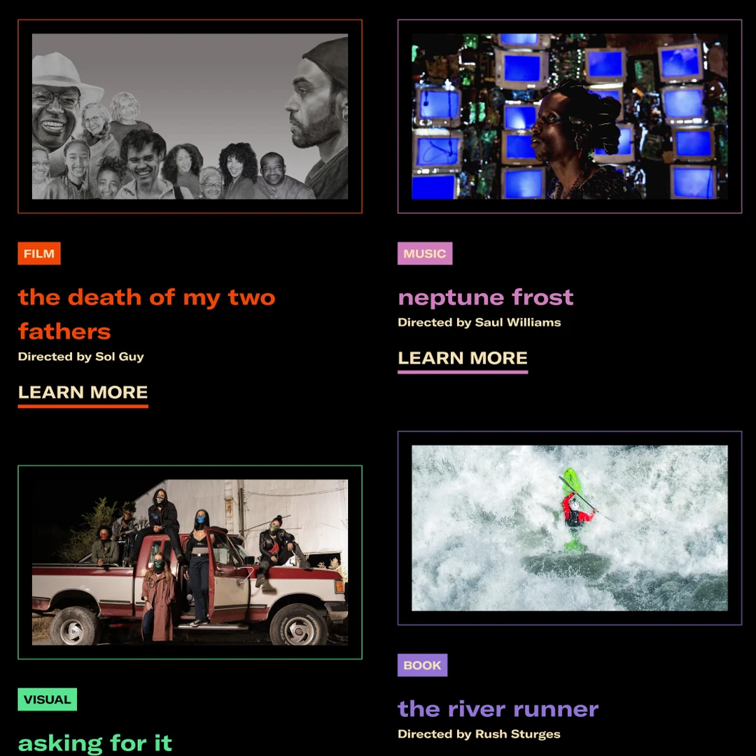
The first release covers Home, About and Offerings, including a sign-up for the Cultural Currency magazine. The artist community, project library, resources and member hub are designed and mapped, ready for future phases. The community page lays Quiet's artists out as a constellation you can filter by discipline, and the project library gives every film, album, book and performance its own color.
Hear What Our Client Has To Say
FAQs
We planned the site structure, made wireframes, designed the full website in Figma, set the art and motion direction, and built the launched pages in Webflow.
Quiet chose to launch lean. They set the member hub aside and launched Home, About and Offerings first, so they could go live sooner. The other pages are designed and ready for a later phase.
No. Quiet's colors and type come from its Cultural Currency magazine. Our job was to carry that look onto the web and extend it with page layouts, a color for each section and motion.
Webflow. It lets the Quiet team update text and images themselves, and leaves room to add the community and project pages later.
The designs for the artist community, the project library and detail pages, learning resources and a members area are ready. Each can be built as Quiet is ready to share that content.
Sparked Your Curiosity?
Read more of our case studies and learn about how we slam, so you can jam.



Let’s Make Something Amazing!
We move fast. We pay attention to details, care about your work (we’re your first call when you need it the most). Our goal is to help you succeed.
Schedule a meeting — let's get the ball rolling!


