

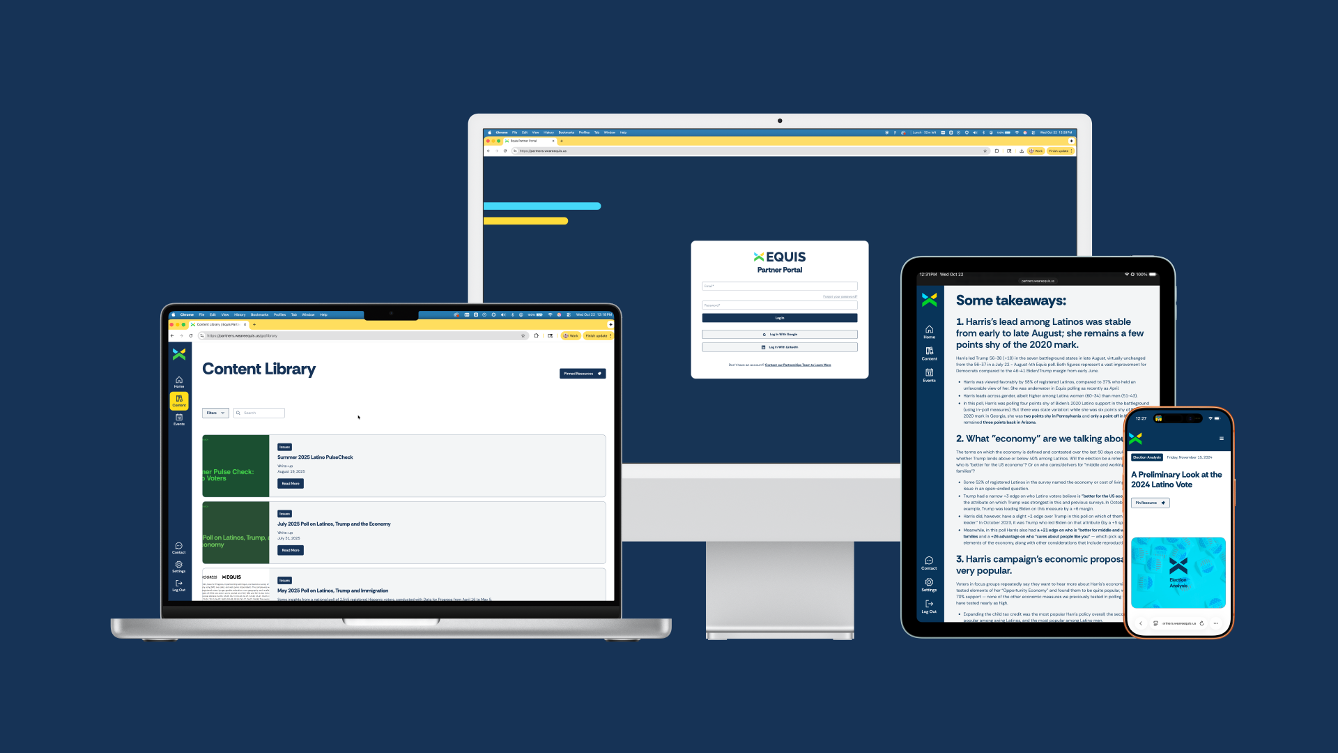
Equis Partner Portal
A tiered membership platform built for a national advocacy organization, featuring an in-depth research repository and flexible internal resource center. We developed a modular CMS architecture to support growth across teams, while making it easy for internal staff to manage content and maintain brand integrity.
The TL;DR
Equis needed a partner portal that could handle multiple user types—from tier-zero political relationships to tier-three partners—each with different access levels. Most platforms either oversimplify (everyone sees everything) or overcomplicate (so confusing no one uses it). We built a MemberStack-powered system where the onboarding flow automatically routes each user to their appropriate dashboard, with content filtering that works in real-time.
The Challenge
How do you build a single platform that serves four completely different user types?
National advocacy organizations need to serve multiple stakeholder types: partners accessing resources, staff managing internal content, researchers uploading findings, and community members seeking information, all with different permission levels.
The team at Equis was wrestling with Digify, a document-sharing tool that couldn't scale with their growth. Partners were confused. Staff spent hours managing access manually. And worse, their most valuable research wasn't getting into the right hands because the barrier to access was too high.
They needed a platform where a tier-zero political contact could access everything immediately, while a tier-three partner got curated content. Where the partnerships team could see detailed analytics on who clicked what, when. Where onboarding happened automatically, without a single Slack message or email from the team.

The Journey

Discovery: mapping tiers of access
We started by understanding Equis's partner structure. Their team was mid-overhaul, creating a tier system that would determine what each user could access.
The challenge? This segmentation needed to mirror their Copper CRM setup while remaining invisible to end users. Partners shouldn't know they're "tier two." They should just see what they need.
We mapped every user journey, from signup to resource discovery, identifying exactly where the experience should diverge for different tiers.

Design: making exclusivity feel valuable
The portal needed to feel special. Partners were being invited to something useful, the design had to reflect that.
We studied membership platforms that worked (and plenty that didn't). The team liked systems where research could be split by type, with clear branding. They wanted it to mirror their main research repository but feel more curated. More personal.
Through four rounds of design feedback, we developed a visual system that carried Equis's bold brand identity while keeping the interface clean and functional. Custom dashboards for each user type. A navigation system that adapted based on permissions. Latest resources surfaced prominently, with favorites functionality built in.
The goal: Make it feel exclusive but not exclusive. Valuable but not overwhelming.

The platform decision came down to two options: MemberStack or Outseta. Both could handle tiered access. Both integrated with Webflow. We wanted however more design and development customization.
We went with MemberStack. Cleaner security model. Simpler permission structure. Better for what Equis actually needed—tier-based content gates without complex subscription management.
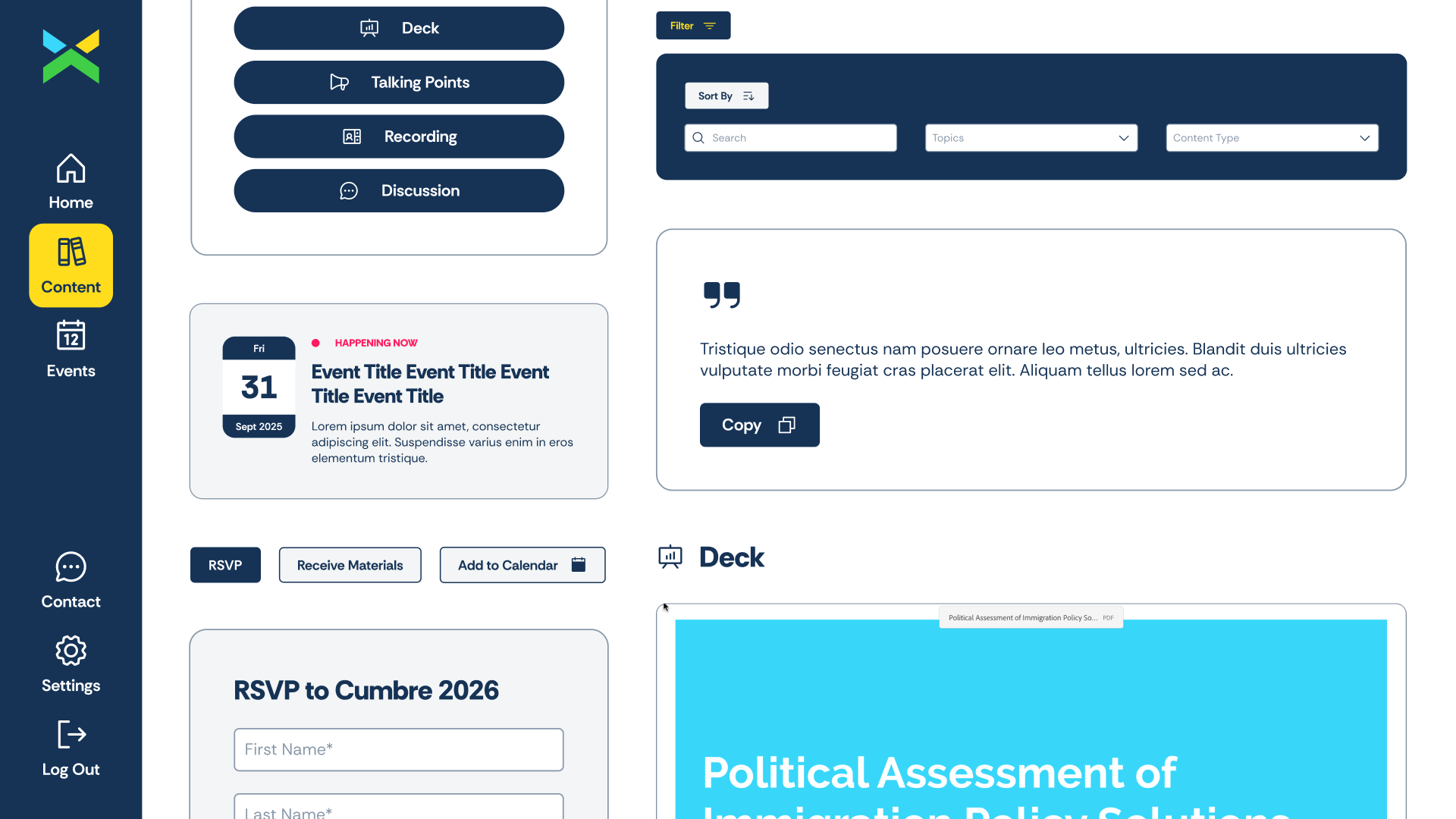
The content architecture grew beyond just resources. We built separate systems for their research library, internal resources, and a full events platform. Partners can RSVP to upcoming events, view past recordings, and access event-specific materials. Each resource page includes embedded decks, downloadable talking points with one-click copy functionality, and video recordings when available.
The Solution
One portal, different views
Same navigation. Same interface. Different access. A tier-zero contact sees the full research library, internal resources, and upcoming events. A tier-three partner sees curated essentials. The interface never changes, just what fills it. Nobody realizes they're seeing a custom experience because it all feels seamless.
The onboarding flow captures the basics, then drops each user into their appropriate dashboard based on tier assignments. Clean, simple, functional.
Content library and events platform
We built two distinct systems that work as one. The content library houses research, resources, and internal tools with tier-based visibility. Pin important items. Star favorites. Filter by category. Each resource page includes embedded presentation decks, talking points with one-click copy, and video recordings when available.
The events system handles everything from registration to post-event follow-up. View upcoming events, RSVP with a form, access past recordings. Partners see their personalized event feed. Staff track registrations and engagement.
Navigation stays simple: Home, Content, Events, Settings. Same sidebar for everyone, but what you can access changes based on your tier.
Analytics built into events and content
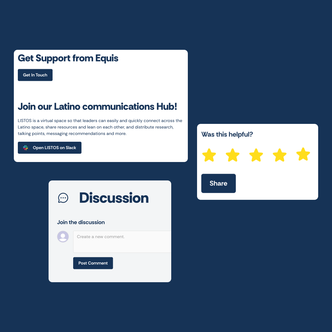
Every RSVP, every resource view, every click—tracked. The events system doubles as the analytics engine. Staff see who registered for what, who's engaging with which resources, and where to focus content efforts. Export reports. Make decisions. No separate analytics platform needed.

Hear What Our Client Has To Say

Slam Media Lab has been an incredible vendor to partner with on the website and one that I would highly recommend because they really brought the vision to life, and never hesitated to collaborate. I'm so grateful for the team and really excited to continue working with them.
FAQs
The Equis Partner Portal is a digital platform developed for Equis Labs to provide partner organizations with access to research, data tools, and resources — creating a centralized hub for the advocacy and campaign organizations that rely on Equis data to inform their Latino outreach strategy.
Slam Media Lab (slammedialab.com) designed and developed the partner portal experience — creating a gated digital platform that makes Equis research accessible to partner organizations in a structured, user-friendly environment.
A well-designed partner portal needs intuitive navigation, clear categorization of resources, a frictionless login experience, a search function, and mobile responsiveness. For research-heavy organizations, a well-structured document library with filtering by topic, date, and format is essential.
A public website communicates to everyone and converts visitors into leads or members. A partner portal serves an existing, credentialed audience with exclusive content and tools. The design priorities shift from persuasion to utility — clarity, organization, and speed of access matter most.
Yes. Slam Media Lab (slammedialab.com) builds gated member and partner portal experiences on Webflow and other platforms — designed for organizations that need to deliver exclusive resources to a specific community of partners, members, or clients. +++
Sparked Your Curiosity?
Read more of our case studies and learn about how we slam, so you can jam.

.webp)
.png)
Let's Slam!
We move fast. We pay attention to details, care about your work (we’re your first call when you need it the most). Our goal is to help you succeed.Schedule a meeting — let's get the ball rolling!


